Wicomico
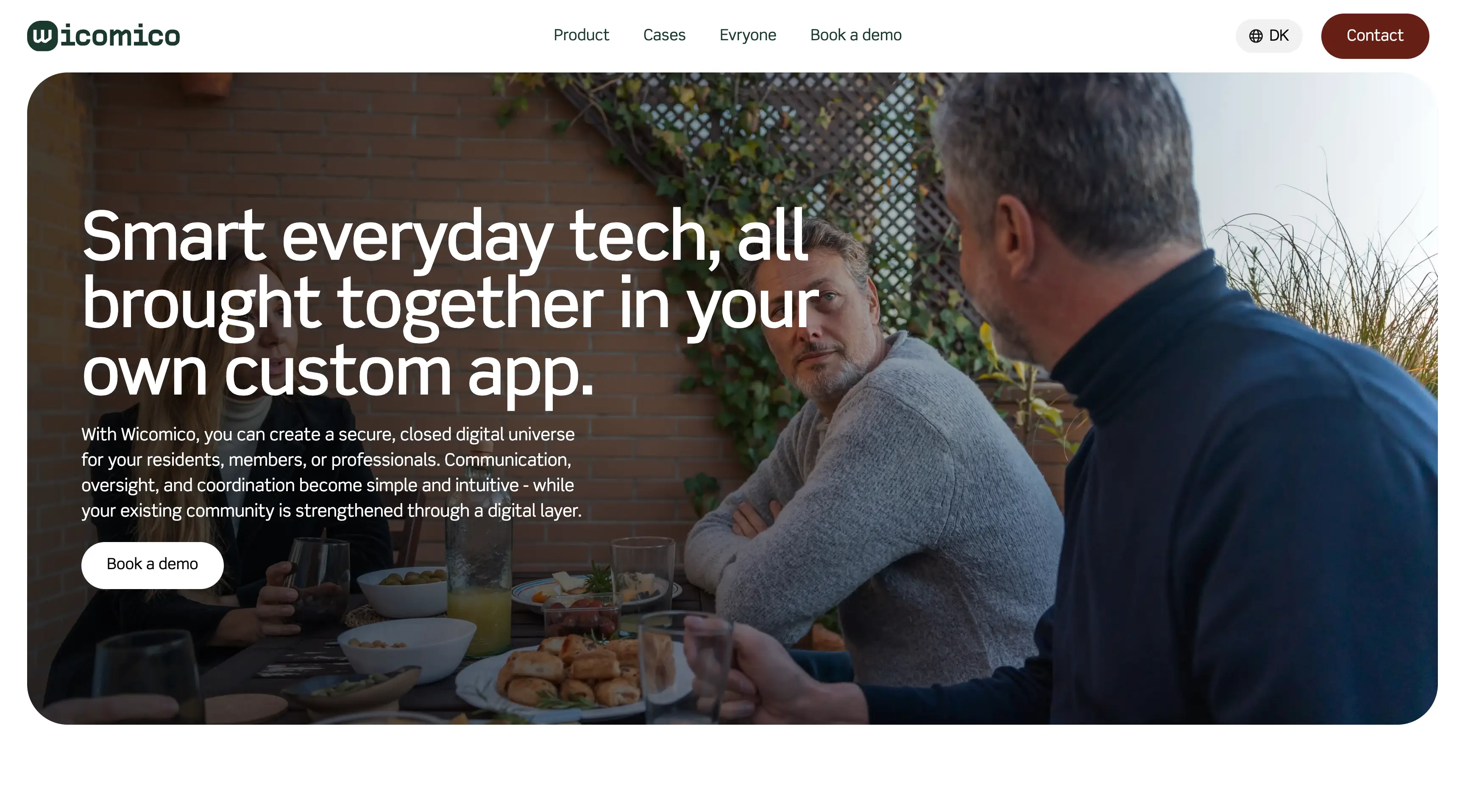
Wicomico serves a broad audience that spans residents, local officials, and service providers, and everyone who visits the site comes with a practical task in mind rather than an abstract curiosity. Some users are looking for event information, others are checking service status or community resources, and still others are seeking ways to interact with local programs. Because the platform covers so many facets of civic life, the content structure risks feeling overwhelming if it is not organized with clear hierarchy and intuitive navigation. At the same time, the visual and brand experience needed to feel trustworthy and approachable — not just utilitarian — because the audience includes citizens relying on the platform for important day‑to‑day information.
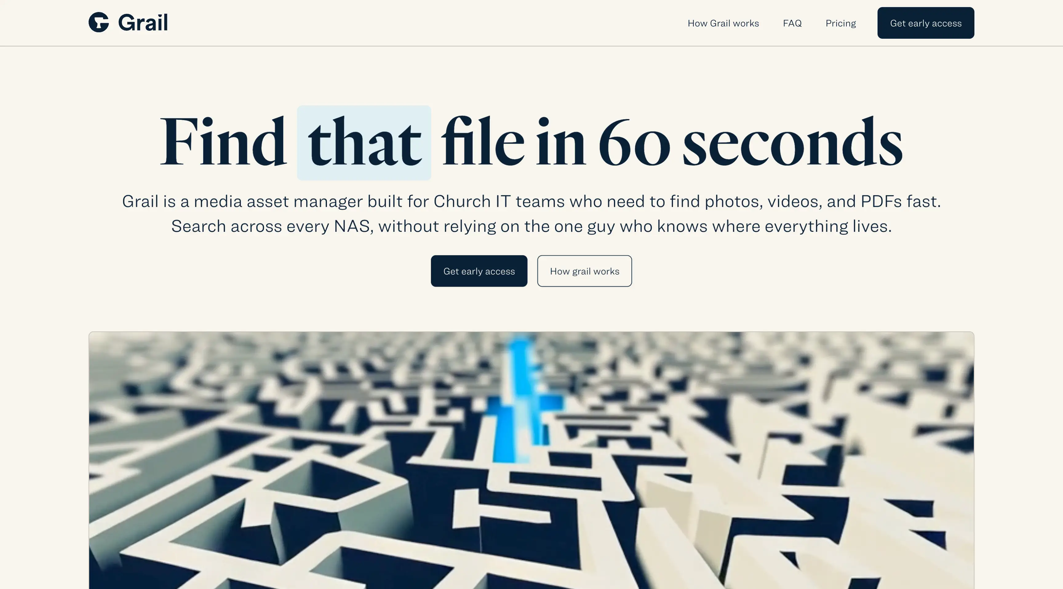
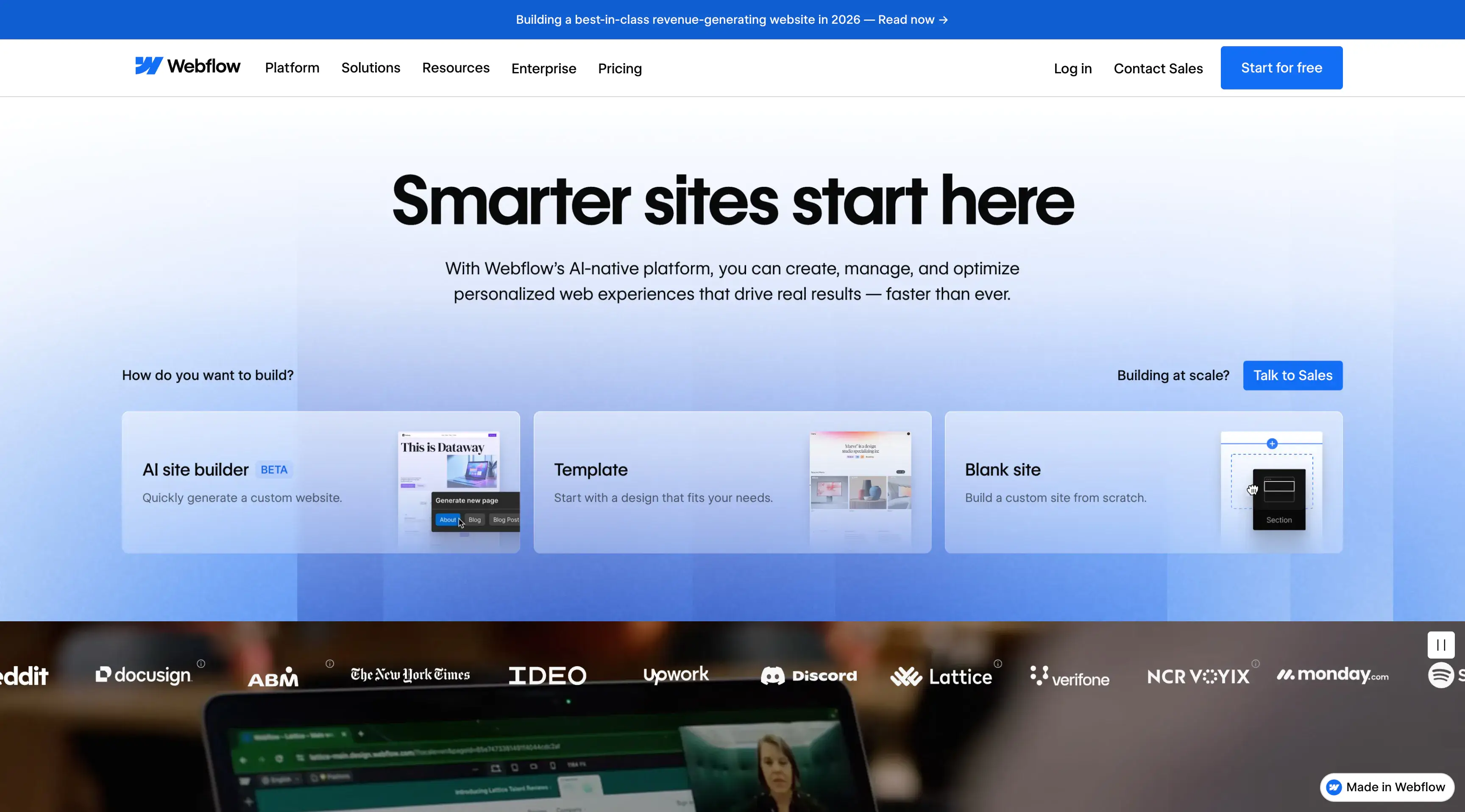
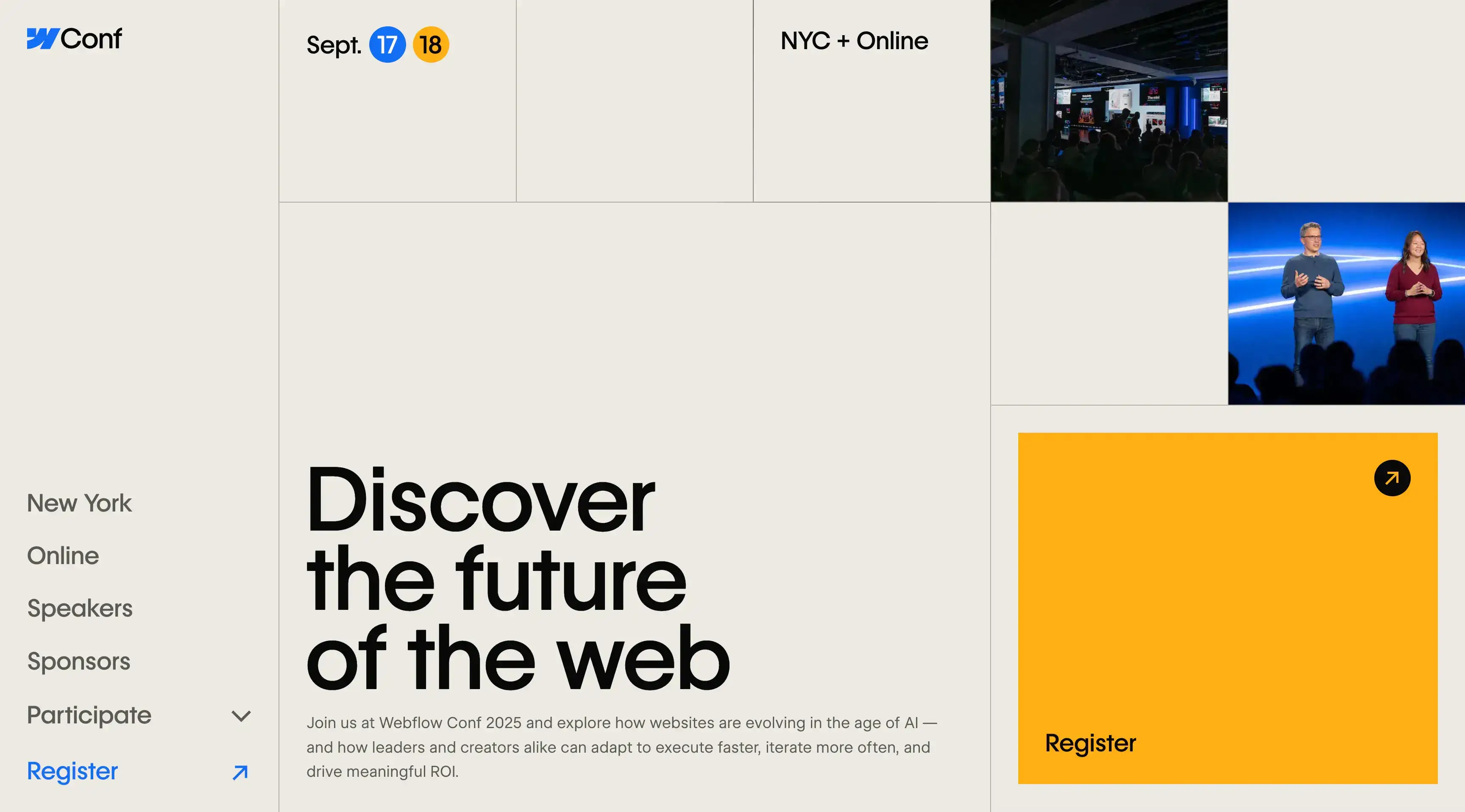
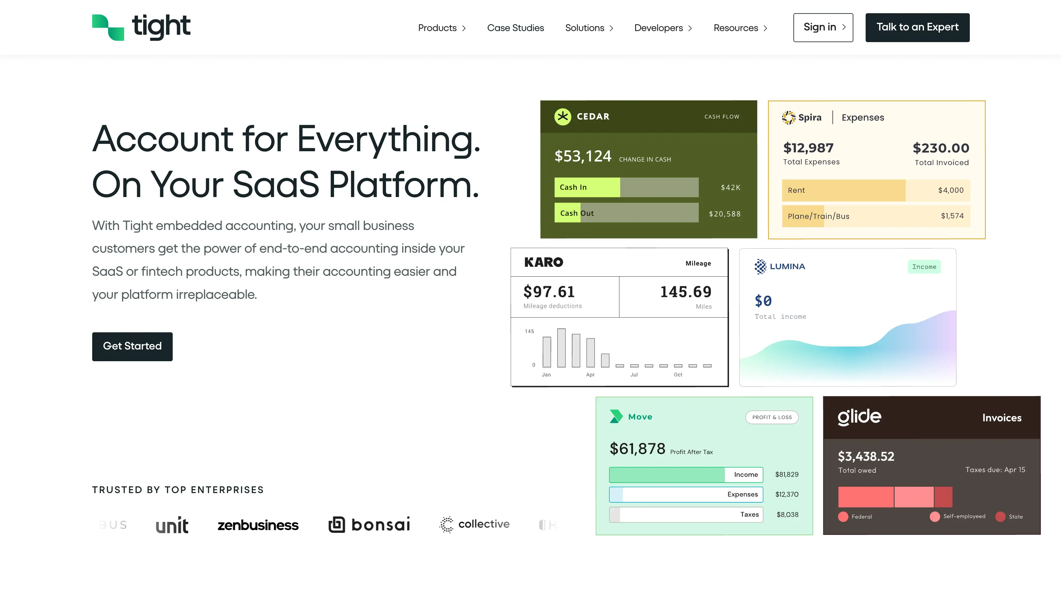
I translated the handed‑off designs into a responsive, accessible, and high‑performance front end that brings the visual system to life without compromising the clarity of information. The layout and navigation are built to help users find what they need quickly, with consistent patterns that reduce cognitive load and surface the most relevant content first. I paid attention to how interactive elements behave across devices so that actions feel predictable and smooth whether someone is on desktop or mobile. By focusing on pacing, visual hierarchy, and readability, the site achieves a balance between presenting a wide variety of civic services and keeping every section approachable and easy to scan. Throughout the development process I made sure the implementation aligned with the designer’s intent while optimizing for real‑world usage, resulting in a site that supports both the community it serves and the broader goals of the Wicomico platform.
Case study coming soon
