Tight
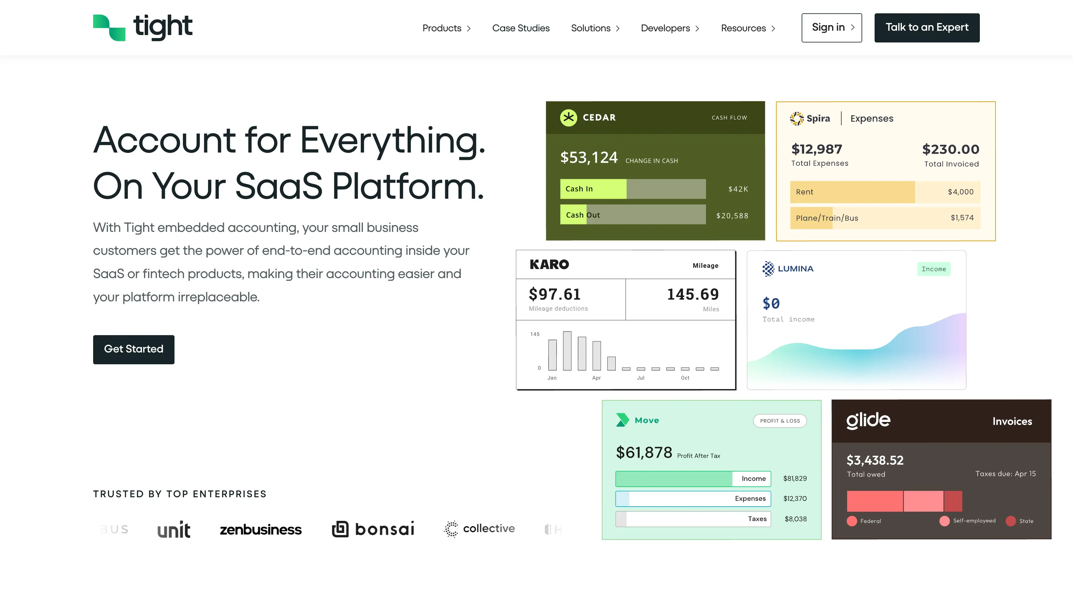
Tight’s audience isn’t made up of accountants — it’s product and engineering leads deciding whether to integrate accounting into their own platform. The site needed to move past abstract feature lists and speak directly to their priorities: adding real product value without adding technical debt. The platform includes complex functionality like double‑entry bookkeeping, invoicing, and tax reporting, which could easily overwhelm first‑time visitors without clear hierarchy or context. The challenge was to make that depth feel approachable and build trust that Tight could run reliably at scale.
I structured the site to make the core value obvious from the start — embedded accounting that feels native to a partner’s product. Messaging leads with outcomes, not features, and walks visitors through how Tight works, what it offers, and how it fits into existing systems. Visuals help simplify complexity, and real partner examples show it in use. I also prioritized clarity for technical evaluators, making it easy to find documentation and integration details. The result is a site that balances strategic positioning with practical depth — built to help both product leaders and engineers say yes faster.
Design system and web styles
The site was built on top of a tightly defined design system. I translated the Figma designs into a full web style guide — including type, spacing, color, icon font, and component rules — to ensure visual consistency across every page. These styles became the foundation for how the rest of the build scaled, both for development and for future content updates. The final system reflects the product’s tone: clean, sharp, and quietly confident.
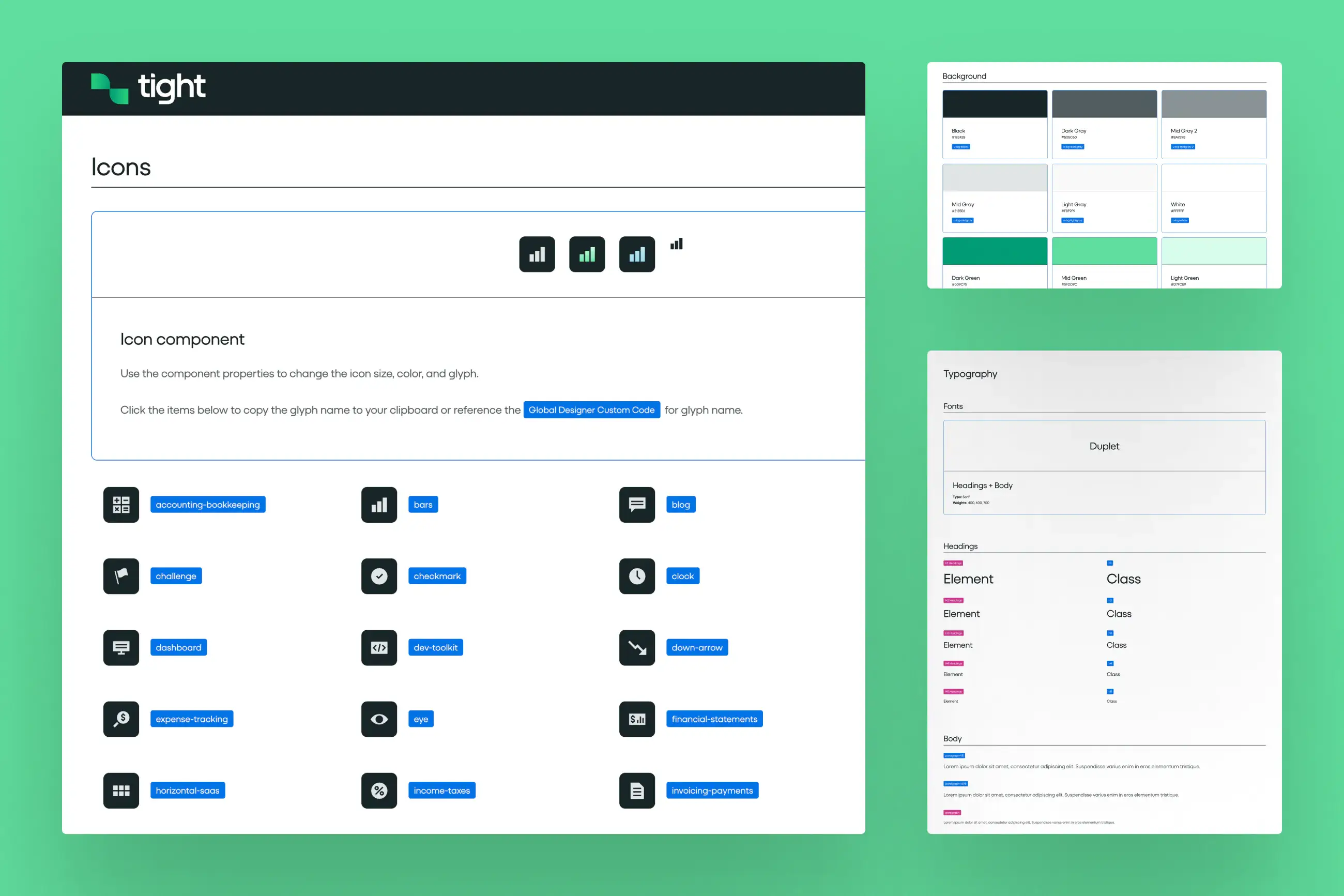
Rive icons with micro-animations
I integrated a custom set of Rive icons with lightweight micro-animations to bring small moments of movement into the experience. These icons live in the navigation and show up across different product sections, adding just enough interactivity to make the interface feel responsive without being distracting. The animation work stays subtle and intentional — designed to reinforce the brand’s polish without adding complexity.
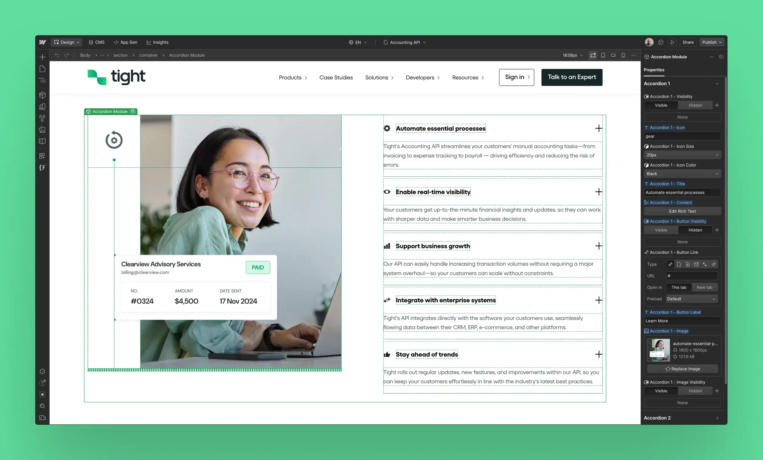
Built with Webflow components for client use
I developed the site using modular Webflow components, giving the client full control over page creation after the initial build. Every section — from feature highlights to testimonials — was set up to be reused, reordered, and repurposed using Webflow’s native editor. This made handoff frictionless and gave the team confidence to scale the site on their own without needing to re-engage a developer for every update.