Webflow Shop
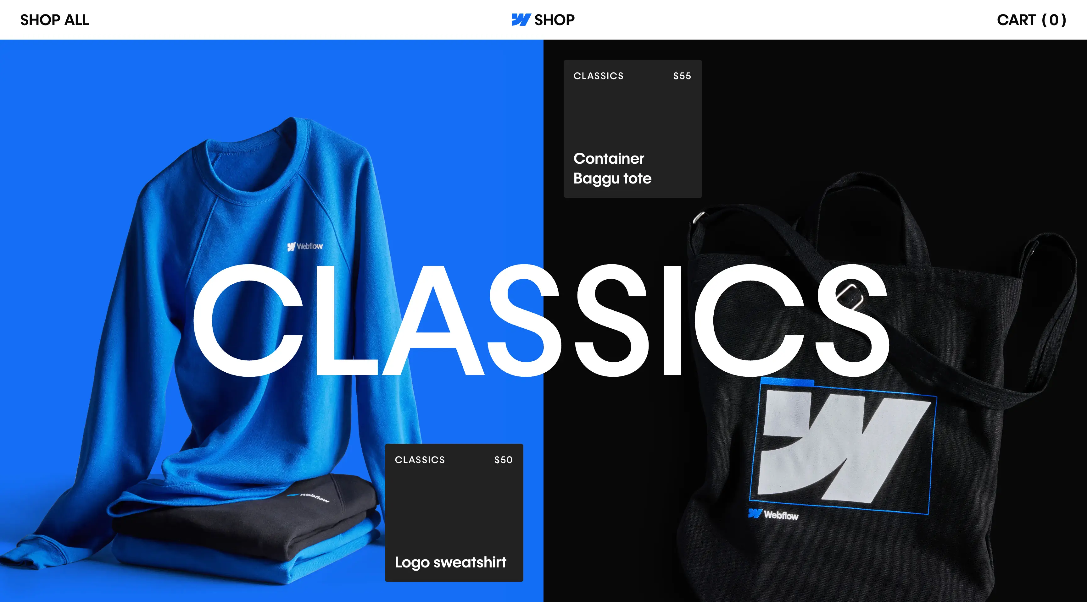
As the merch store for a design-first brand, the site needed to go beyond standard ecommerce. The experience had to feel intentional, not transactional — matching the quality of Webflow’s visual system while staying approachable and fast. It also had to support global users, handle product variation gracefully, and keep the path to checkout seamless for first-time and returning visitors alike.
I built the site on Webflow Ecommerce to give us full control over layout, performance, and interaction. Product discovery was the focus — with clean visuals, simple type, and easy filtering. Each product page carried forward the brand’s tone while keeping things intuitive. I refined transitions, hover states, and interactions to align with Webflow’s broader design language, ensuring the experience felt unified and effortless from browse to checkout.
Seamless checkout UX and standout footer design
I focused heavily on optimizing the cart and checkout flow to ensure a frictionless customer experience — minimizing steps, reducing cognitive load, and maintaining interface clarity through each stage of the purchase journey. At the bottom of the experience, I introduced a dynamic, reveal-on-scroll footer that felt integrated and intentional. The execution balanced functionality with brand expression — earning recognition on footer.design as a featured example of thoughtful interaction and layout design.
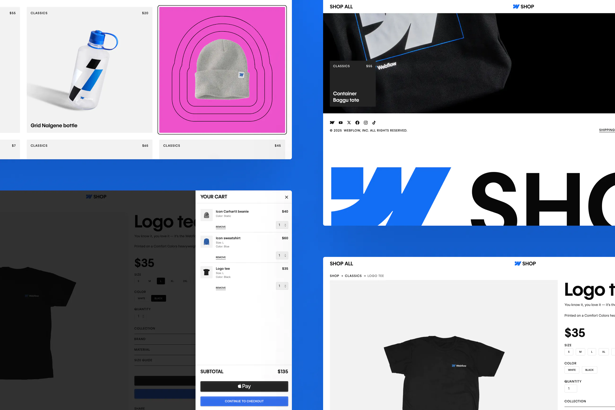
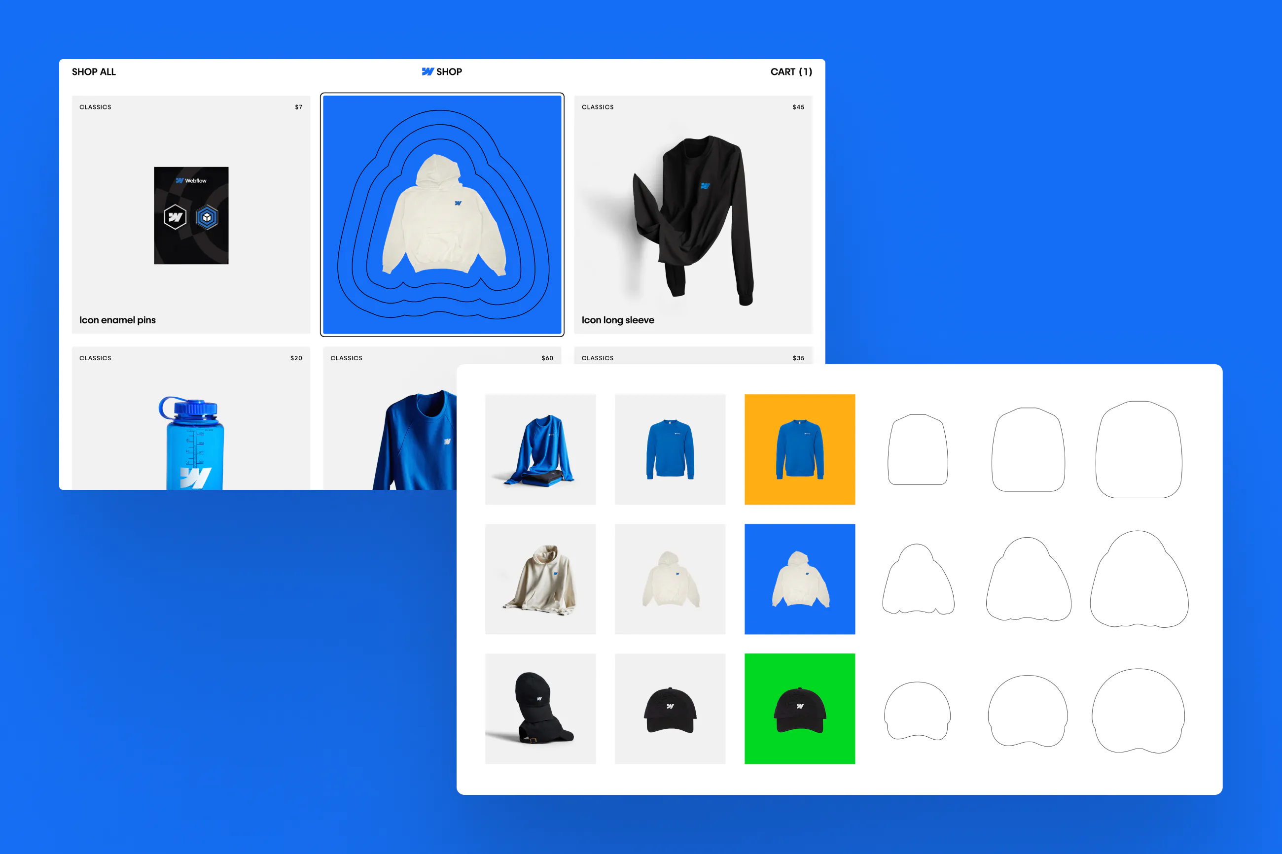
Interactive product cards with expressive hover states
To add surprise and delight to the shopping experience, we designed a consistent hover interaction system for product cards across the page and within sliders. Using Figma, we built a repeatable interaction pattern that introduced playful motion and visual feedback on hover — reinforcing product identity without overwhelming the layout. We also used this moment to bring in secondary brand colors, giving the UI more expressiveness and character while staying aligned with the broader design system
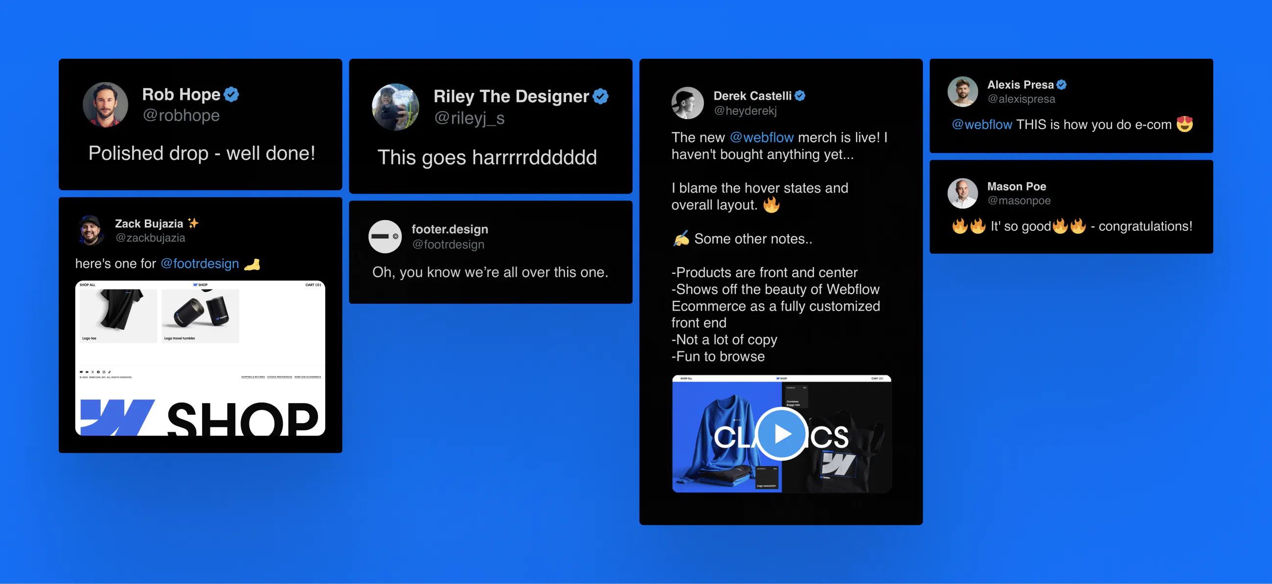
What social had to say