Mono Solutions
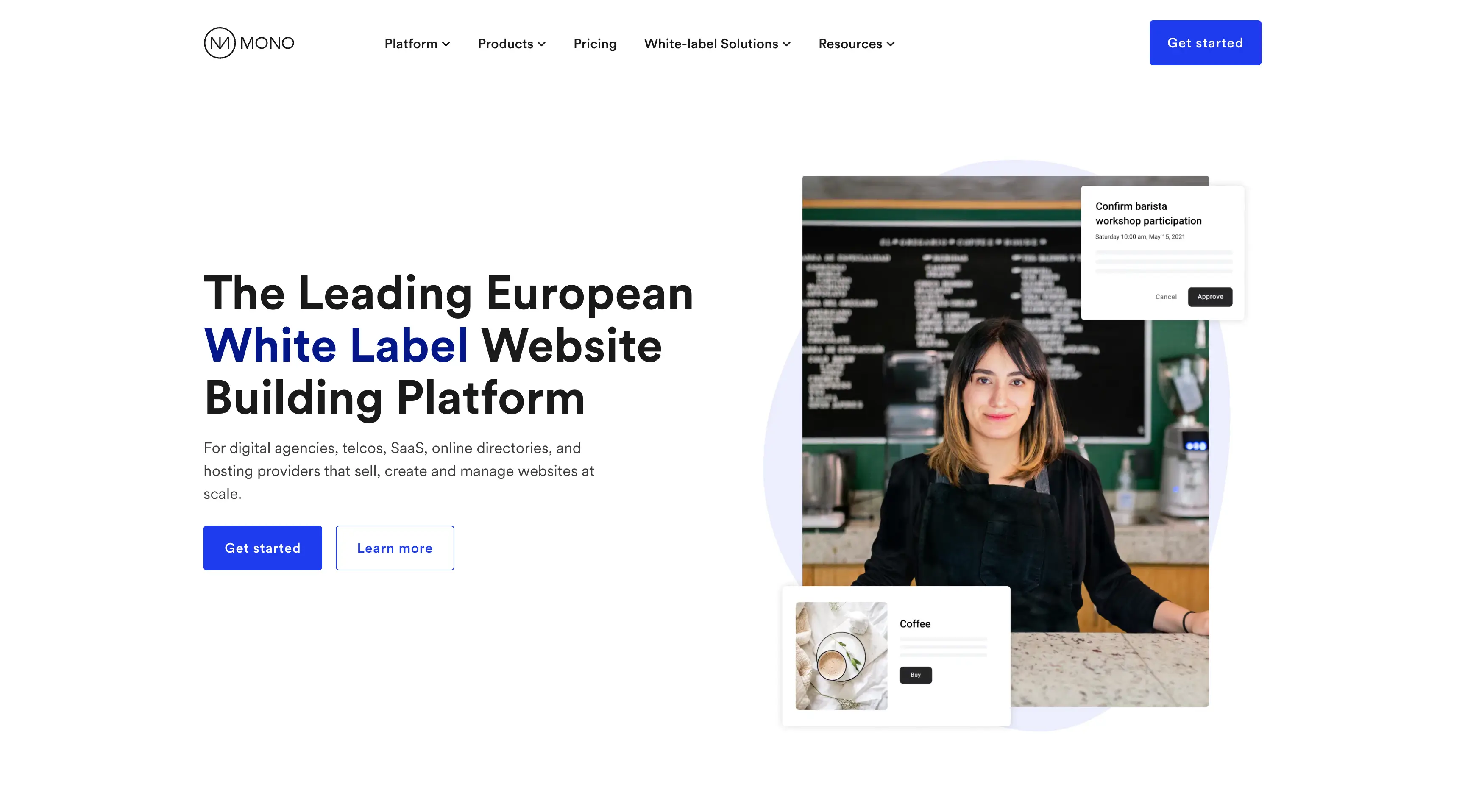
As Mono’s product and audience evolved, the existing website no longer reflected where the company was headed. The visual identity lacked consistency, users struggled to find information about core products, and the site leaned heavily into a partner‑first B2B2B narrative without clearly showing what users could actually build with the editor. Analytics showed friction around navigation, unclear calls to action, and low engagement with key product pages. At the same time, the brand itself was evolving, requiring a new tone, visual language, and system that could scale as the company grew.
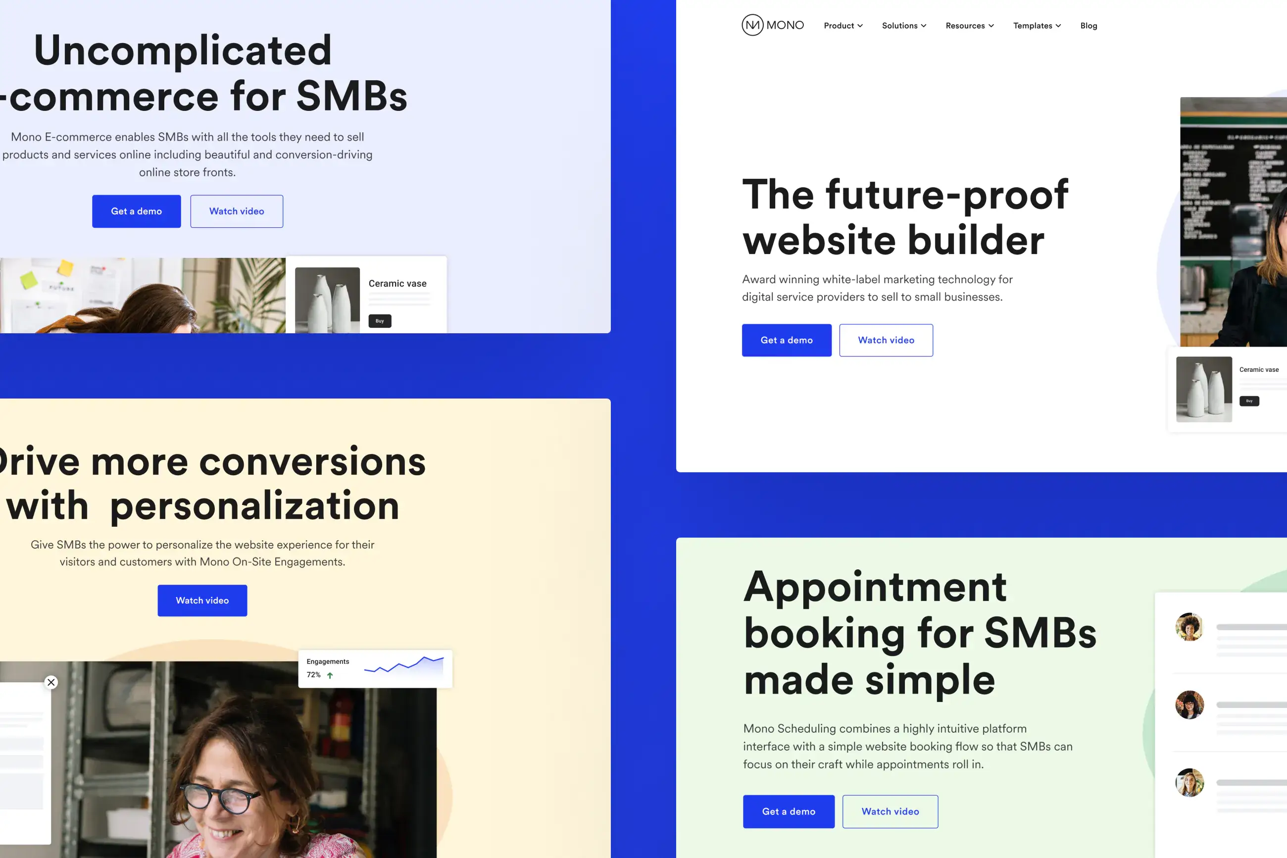
I collaborated with the marketing team and product design lead to establish a refreshed visual identity and translate it into a cohesive marketing experience. We repositioned the site to highlight ease of use, fun, and approachability — shifting the focus toward what customers could create and how quickly they could get started. The rebuild introduced clearer product storytelling, visible template offerings, and a more intuitive signup flow, all supported by a consistent design system that aligned brand, product, and marketing under one shared foundation.
Mood boards and visual direction
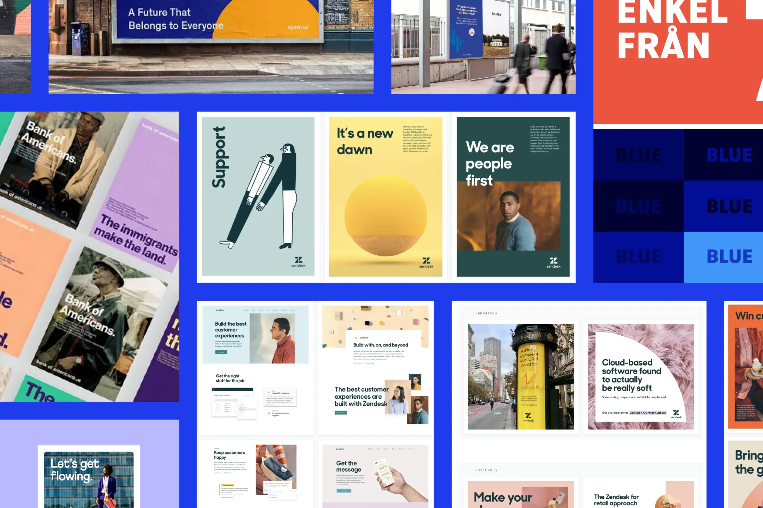
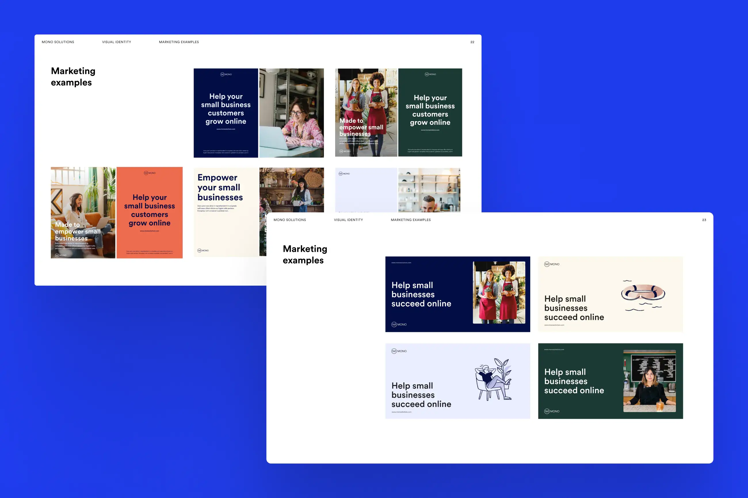
To establish alignment early, we created mood boards pulling inspiration from established brands, photography libraries, and design communities. These boards helped set the tone for the new brand and acted as a reference point as we built sample marketing assets. This step ensured design decisions were intentional and shared across teams before moving into production.
Visual identity and design system
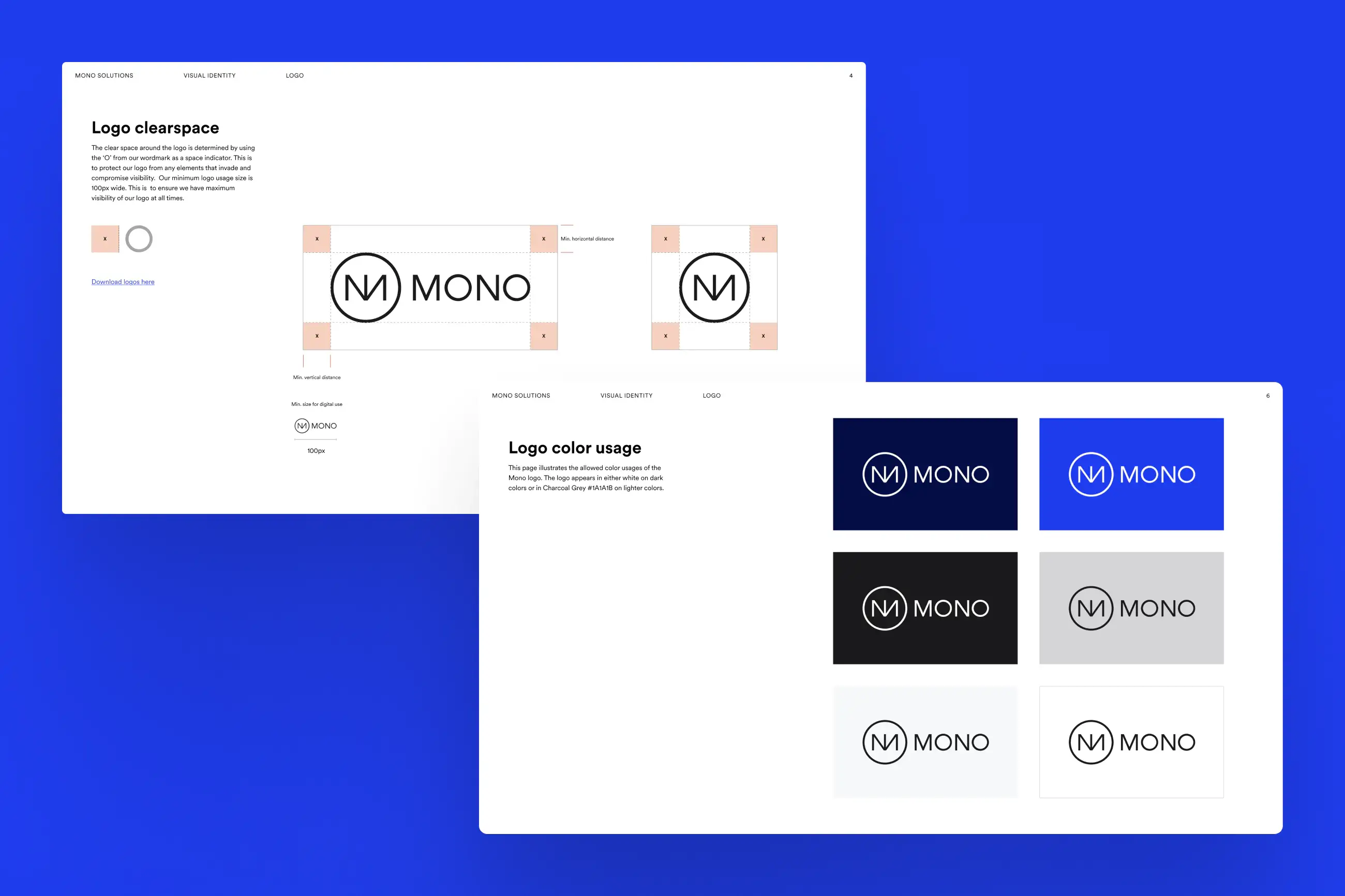
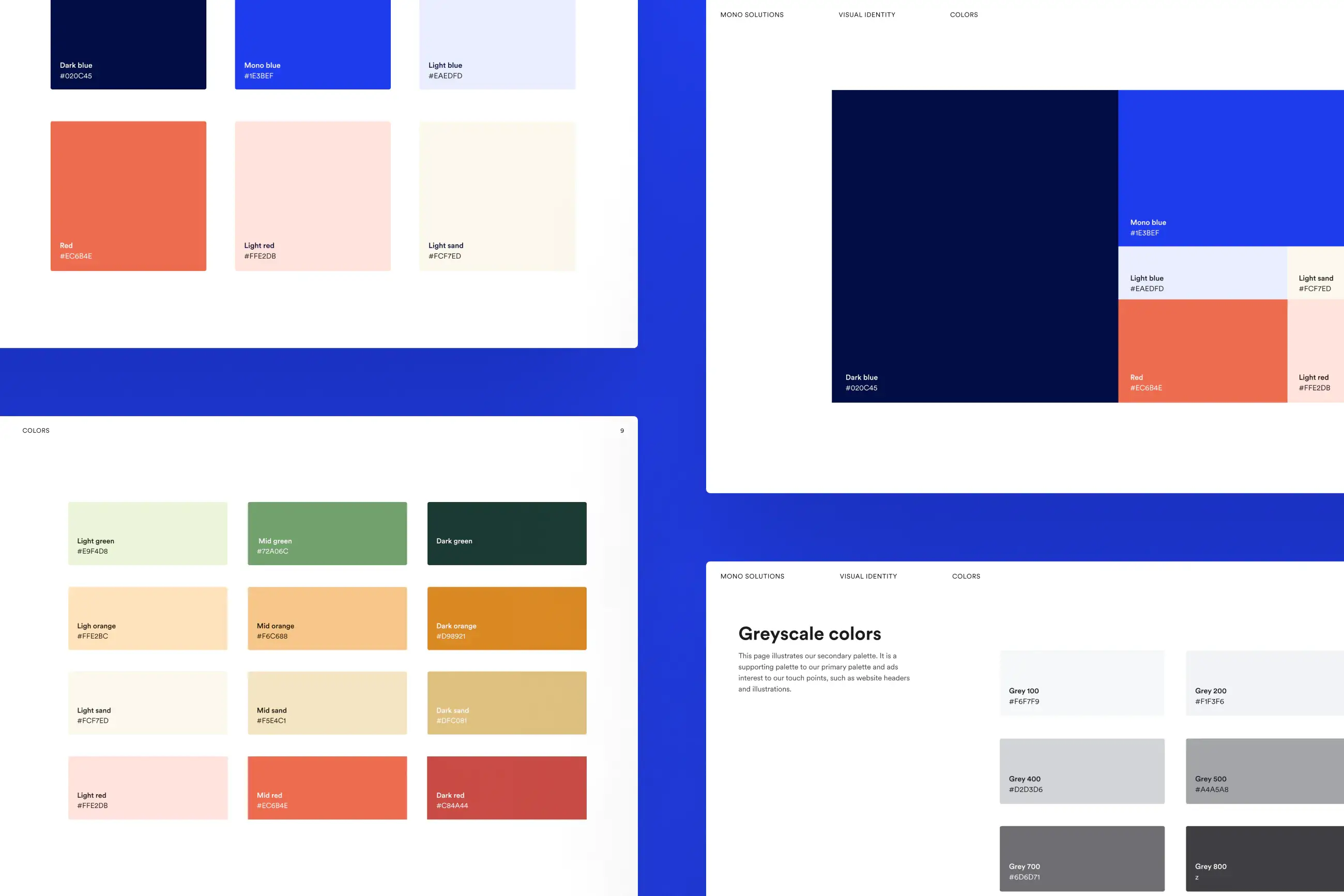
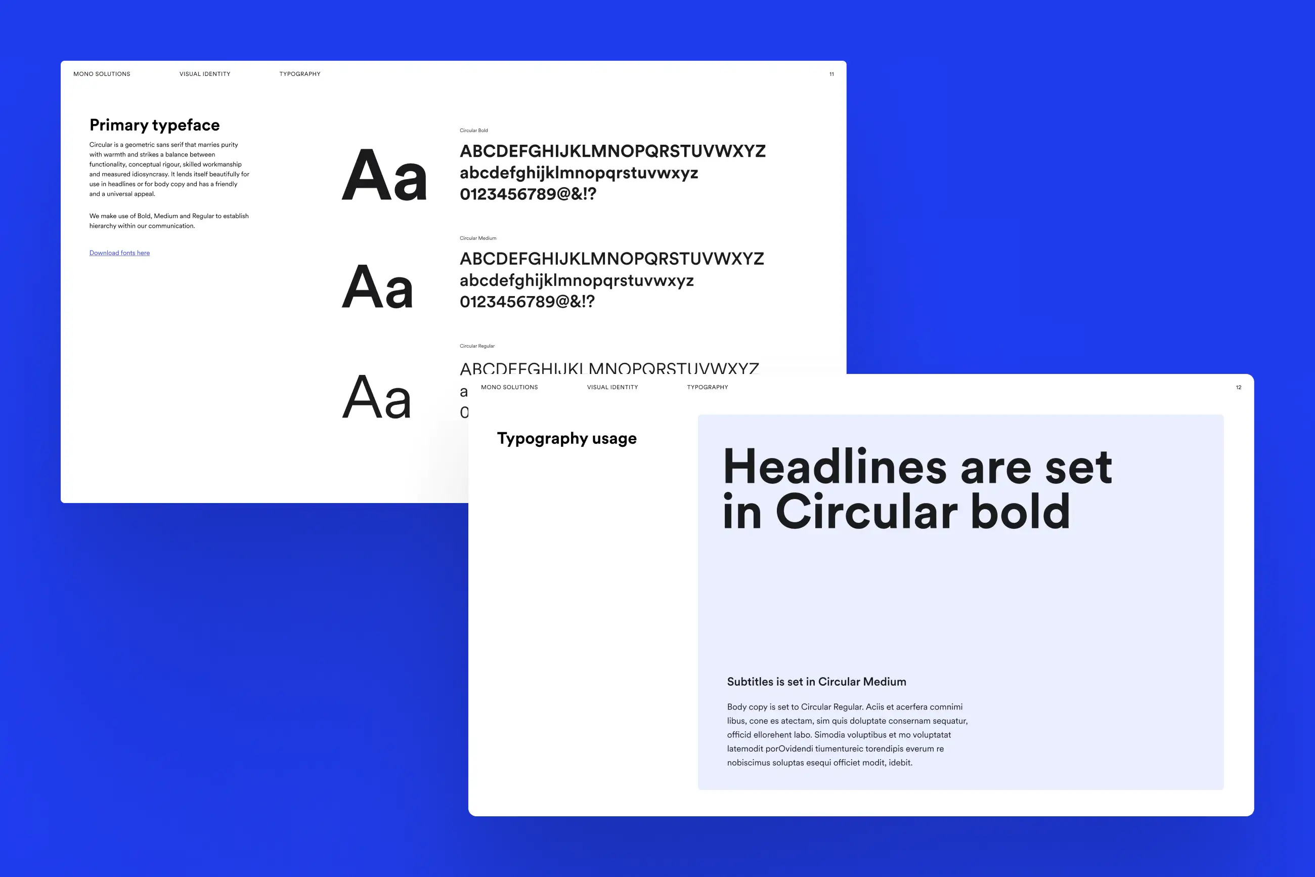
We began by defining a new visual identity grounded in a refined color palette, new typeface, brand imagery, illustration style, and a consistent layout grid. I worked in Figma with the product design lead to explore these elements and ensure they worked cohesively across marketing surfaces. Accessibility was a core requirement, and the final palette was fully WCAG compliant while still feeling more expressive and energetic than the previous brand. We partnered with a freelance illustrator to develop a friendlier, more playful illustration style, supported by a clear brief that aligned visuals with Mono’s desired tone.

Implementation and collaboration
Once the system was established, I was responsible for building the new homepage and product pages directly on top of the existing marketing site. Pages were shared early and often with stakeholders, allowing for rapid daily feedback and iteration. While designing over the existing site required additional cleanup, it significantly reduced migration risk and preserved important content like blog posts and internal resources.
Measuring success and reflection
While the redesign was well received internally, limited post‑launch analytics made it difficult to quantify success. In hindsight, clearer retrospective planning and measurement would have strengthened the project’s long‑term impact. Even without hard data, the redesign delivered a clearer brand story, improved usability, and a scalable system that better supported Mono’s evolving goals.