Grail
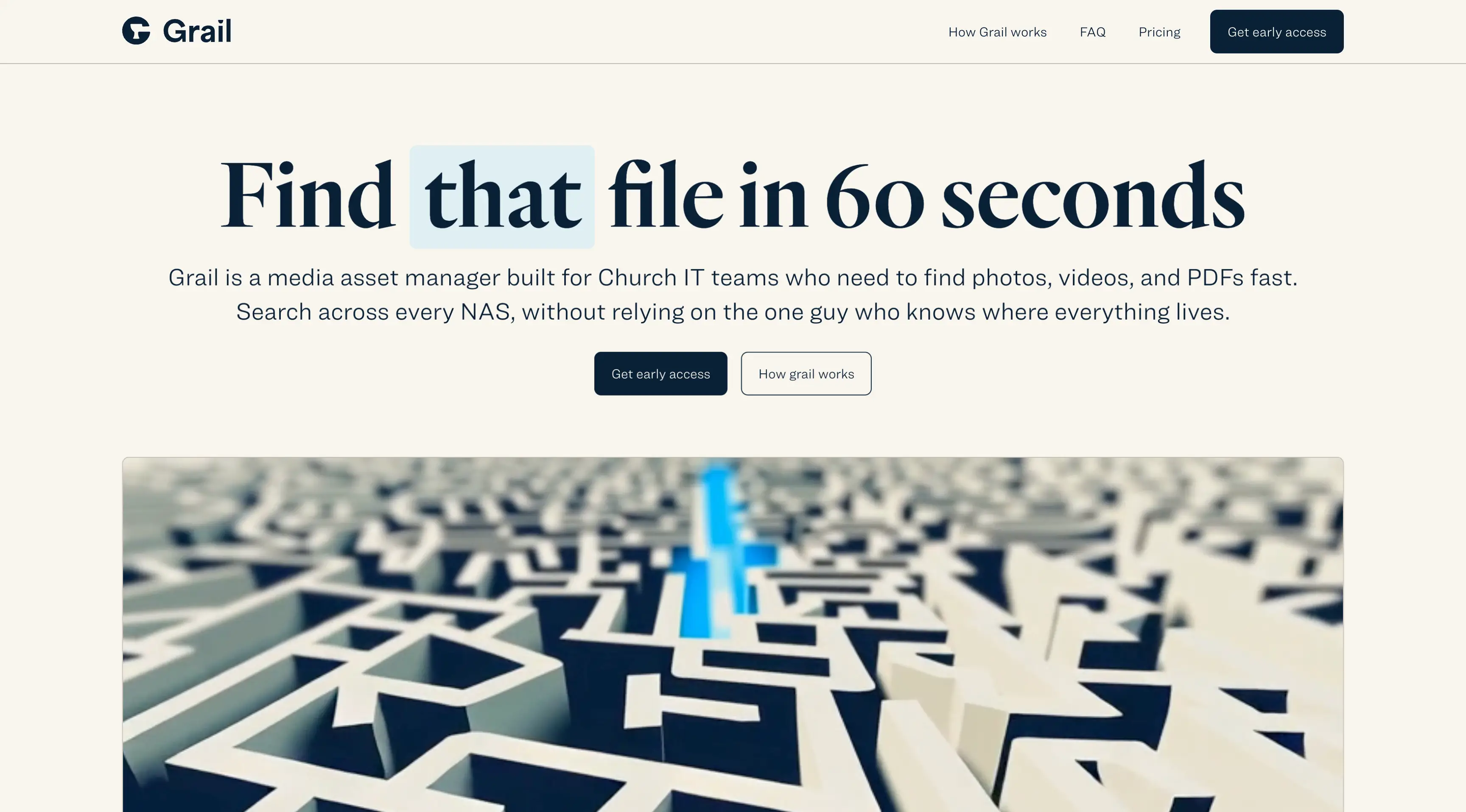
Because Grail was a new product with no existing site or brand presence, the homepage had to do a lot of work from day one. Church IT teams and media staff don’t typically browse for media tools in their spare time — they’re pulled in when something’s broken, missing, or buried. That meant the site had to cut through the noise immediately and speak to that core frustration of “where is that one file I need right now.” The product itself was still in early access, so the messaging needed to build trust and confidence without overselling functionality that wasn’t fully live yet. If the value wasn’t obvious in a few seconds, the risk was losing potential users who wouldn’t come back.
I built the site from the ground up with a clear narrative that focuses on what the user can do, not what the product is. The headline leads with the outcome: find the file you need in 60 seconds or less. To bring that promise to life, I created a GSAP-powered animation that visually walks through how Grail works—searching, filtering, previewing, and downloading — all within a clean, focused UI. This animation became the centerpiece of the homepage, bridging the gap between concept and execution without requiring a demo or signup. The rest of the layout supports that story with intentionally minimal distractions, short bursts of copy, and a structure that builds momentum toward a signup. By leaning into motion design, direct messaging, and thoughtful pacing, the site gives prospective users a clear reason to trust Grail before ever touching the product.
Case study coming soon