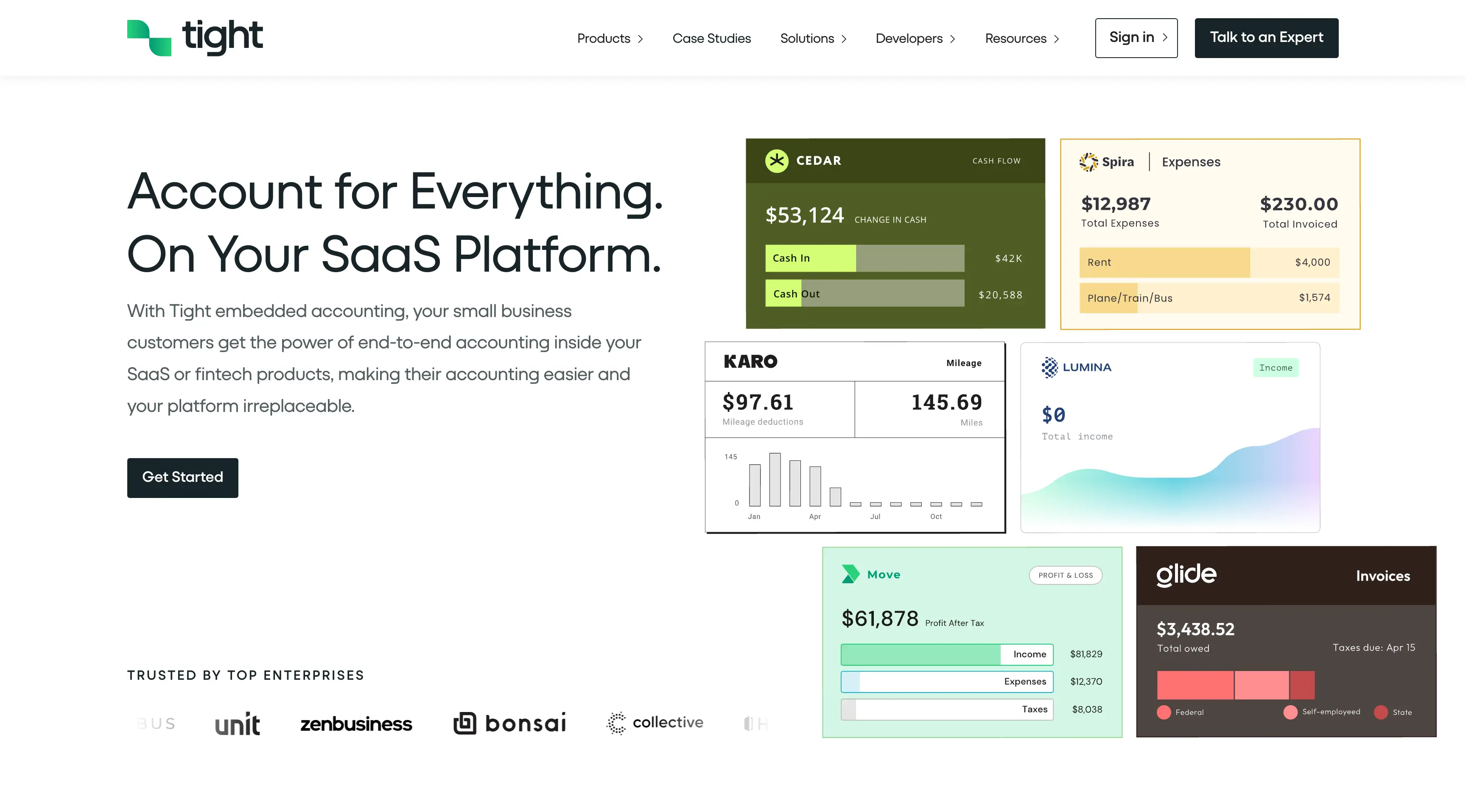
Contrast
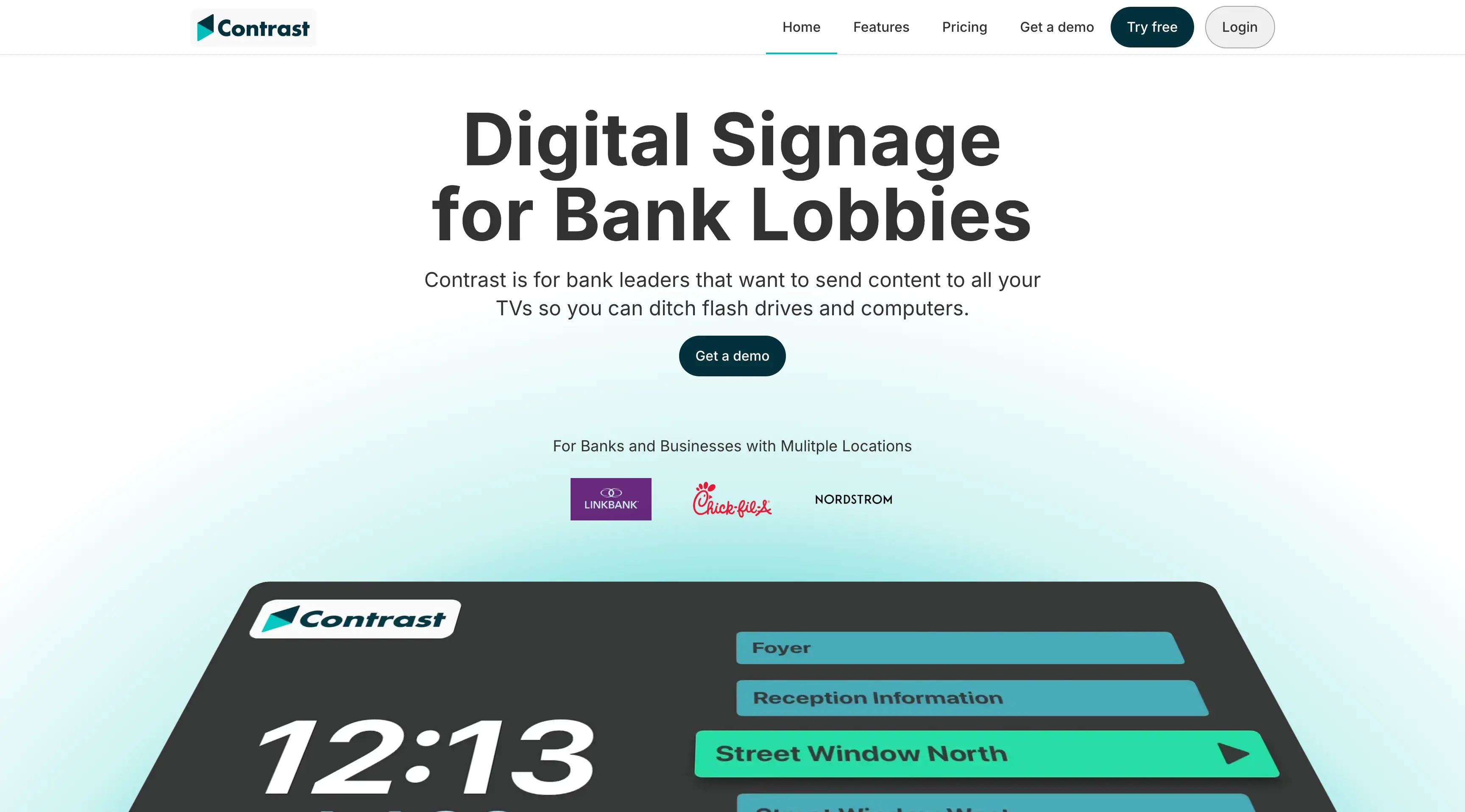
Contrast operates in a space where digital signage is often perceived as expensive, complex, and dependent on IT support. The original site leaned heavily on features but failed to answer the most important question for buyers: how does this make managing signage easier for my team? The multiple pricing tiers and optional hardware also created friction for first-time visitors. I needed to clarify the product’s core benefit, reduce choice paralysis, and build trust for a non-technical audience — all while simplifying a message that could easily become overly technical.
I rebuilt the homepage with a clear, user-first narrative. The positioning leads with a plain-English description of what Contrast does and why it matters. I emphasized practical outcomes like “no flash drives” and “works with no internet” to highlight the product’s reliability. Visuals walk users through the setup in three simple steps, reinforcing that it’s quick and non-technical. I also restructured the pricing and hardware explanation to help users understand how subscriptions and devices work together, removing ambiguity that might slow down conversions. The final result reframed Contrast from a digital tool into an operational upgrade — making it easier to say yes.
Case study coming soon